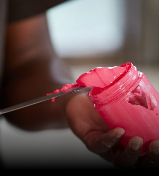
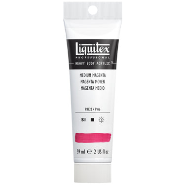
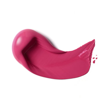
Let’s take a journey into the vivid bright red-purple which is Medium Magenta. In the Liquitex palette it’s made up of two pigments - quinacridone magenta (PR122) and titanium white (PW6). Highly opaque and bold, it sits midway between red and blue
HISTORY AND ORIGIN
First made in the lab, the red-purple color we now know as magenta was developed in 1856. Synthesized by Polish chemist Jakub Natanson, it was given the name triaminotriphenyl carbonium chloride and commonly known as fuchsine (after the fuchsia flower). In 1859 the tint was formally named to honor the very bloody Battle of Magenta. Napoleon’s Sardinian-French army defeated the Austrians in the Second War of Italian Independence and the battlefields ran with blood the color of fuchsine, which is said to have inspired the link.
Historically, violet red pigments have been fugitive and unstable. Few inorganic pigments have the color impact and natural organic alternatives are mostly impermanent. The 1859 magenta was an aniline dye and had poor lightfastness. This didn’t stop it from leading fashion trends in the second half of the nineteenth century – where the purple pink was used to color the finest clothes and textiles.
DEVELOPING MEDIUM MAGENTA
Today, the color we know as magenta is based on the pigment quinacridone. This gives it stability and permanence. Liquitex Medium Magenta is made of quinacridone magenta and titanium white pigments to give a color with excellent lightfastness and archival longevity.
In scientific terms, magenta is termed an ‘extra-spectral’ color that cannot be generated by light of a single wavelength. Made up of equal parts of red and blue light, it is a pure chroma on the RGB color wheel.
MEDIUM MAGENTA IN ART PRACTICE
Artists have had a long love affair with magenta. Paul Gauguin used it in several of his South Seas paintings and his 1890 portrait of Marie Lagadu. Members of the Fauvist Movement - including Henri Matisse - used it to surprise viewers and conjure up emotions in a new way. Matisse’s Les Toits de Collioure (1905) uses magenta to depict the buildings and landscape. Psychedelic artists of the 1960s worked with magenta to create fantasy visions with a rose-tinted perspective and pop-inspired neon artists use it due to its vivid character.
This is a color of contrasts. As well as being vivid and optimistic, magenta is linked with harmony and balance. At times flamboyant, others quietly brooding, it can shift dramatically when paired with different combinations of color. Pair it with its complementary color, green, to make it pop and stand-out to the max. Toned with other shades of pink, it brings a very different impact to the canvas. Delve into its darker side by pairing with berry colors and rich shadowy browns, or let it shine out with bright blues and yellow.
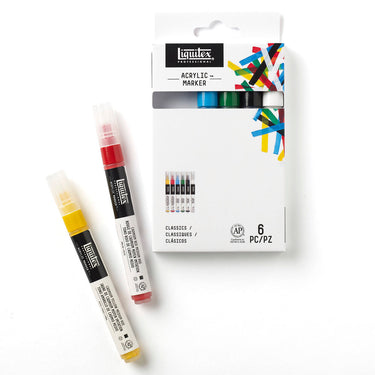
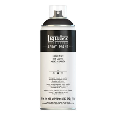
Medium Magenta can be found in Liquitex Professional Heavy Body Acrylic, Soft Body Acrylic, Acrylic Gouache, Acrylic Marker and Spray Paint, and in Basics Acrylic Color and Fluid Acrylic Color.




![LQX BASICS ACRYLIC MEDIUM MAGENTA [SWATCH]](http://uk.liquitex.com/cdn/shop/files/140851_375x375_crop_center.jpg?v=1733425580)
![LQX BASICS FLUID ACRYLIC 118ML MEDIUM MAGENTA 887452055440 [ROW]](http://uk.liquitex.com/cdn/shop/files/112785_375x375_crop_center.jpg?v=1763675199)








![LQX ACRYLIC MARKER SET 6X 2-4MM CLASSICS [CONTENTS] 887452001225](http://uk.liquitex.com/cdn/shop/files/68762_4855e6eb-82d5-4a11-a736-1f41ab15882e_375x375_crop_center.jpg?v=1709305272)
