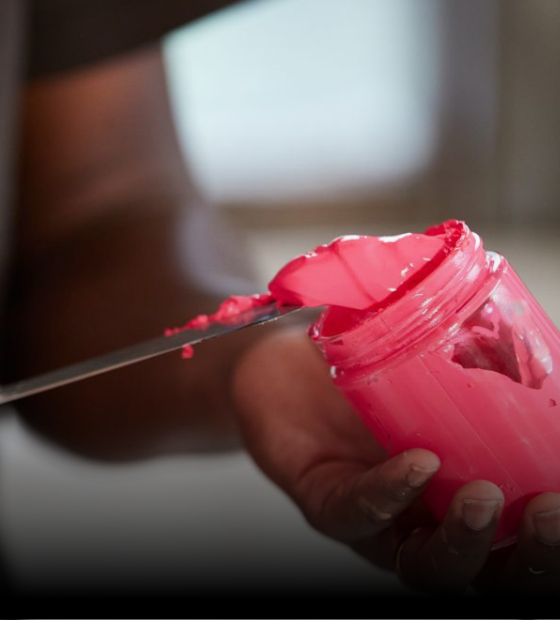
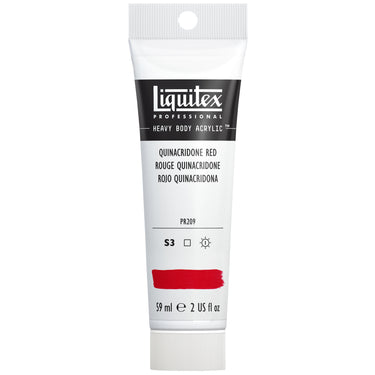
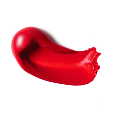
Quinacridone red is part of a family of quinacridone-based pigments – all known for their high performance and exceptional color and weather fastness. Also known as PR209, this is a synthetic organic pigment with a vivid mid-red color, very transparent with high tinting strength.
HISTORY AND ORIGIN
The quinacridone family includes a wide range of high-impact pigments synthesized in the lab. First noticed as a by-product of chemical research in 1896, it’s potential wasn’t recognized until 1955. W. Struve, a chemist at the DuPont company, saw the possibilities and went on to develop a way to economically manufacture it at volume. Three years later in 1958, the first commercial quinacridone pigments were marketed. The spectrum ranged from a golden yellow (PO49) - via PR209 mid quinacridone red - to a dark reddish violet (PV19). The car industry started using them for paint colorants, and makers of artists' paints started production.
THE CHARACTER OF QUINACRIDONE COLORS
Transparent, vibrant and highly lightfast: quinacridones were quickly adopted by the New York abstract expressionist scene which was exploding at the time. The lightfastness gave something new in a part of the palette traditionally made up of fugitive natural organic pigments like rose madder, alizarin crimson, and genuine carmine. Because it was so transparent and vibrant, it lifted the work instantly.
In the studio, the pigment gives a useful transparent warm red and isn’t as intense as many of its relatives in the quinacridone family. What color is similar to quinacridone red? It’s close to cadmium red medium or pyrrole red, but these reds are typically darker valued and produce duller tints. Quinacridone red stays vibrant and holds its color as it dries. It’s transparency also makes it the perfect red for glazing and layering.
QUINACRIDONE RED IN PRACTICE
Wondering how to mix quinacridone red? This pigment is handy for mixing, working well with most colors. It mixes cleanly with yellows and blues, and you can use it on the palette to mix towards both orange and purple in the color spectrum. Let’s look at quinacridone red vs cadmium red. The subtle violet facet in PR209 gives it an advantage over other comparable reds from the cadmium and pyrrole groups – which come up short when it comes to mixing with blue to make vivid purples. Unusually versatile, you’ll find this pigment useful for healthy skin tones in portrait work, botanicals and landscapes, where its coral undertone works well with synthetic organic yellows and greens. Blue turquoises - such as cobalt green or cobalt turquoise – are complementary to PR209.
DEVELOPING QUINACRIDONE COLORS
What is a quinacridone color and how is it made? In the color lab, chemists take two pairs of oxygen and nitrogen atoms grouped in sets of five rings of carbon linked together. This is the “quin” part of the name and gives the basic structure. To achieve each color, the chemists adjust the chemical composition. Each has a unique set of molecules that create a specific pigment through dispersion. The result is a non-toxic, sheer pigment that in acrylic paints can mix extremely well with other colors. As well as artists materials, quinacridones are still widely used in car and industrial paints, plus inkjet printing ink and tattoo artists’ inks – all areas where lasting stability is vital.
Find quinacridone red acrylic paint in our Heavy Body and Soft Body Acrylics ranges, both as series 3 colors.
SHOP QUINACRIDONE RED
Available in Soft Body and Heavy Body










![LQX ACRYLIC MARKER SET 6X 2-4MM CLASSICS [CONTENTS] 887452001225](http://uk.liquitex.com/cdn/shop/files/68762_4855e6eb-82d5-4a11-a736-1f41ab15882e_375x375_crop_center.jpg?v=1709305272)
